Tuesday, August 30, 2011

Change it Up


Today, I made magnets for my magnetic lifeboard ~ "What is a lifeboard," one might query?  It's what I've aptly named the magnetic boards I hung in a small hallway in my home a couple of years ago.  I'll share the "How To's" of this DIY project soon!  Until then, see some similar ones that I hung in a completed office design, here

My lifeboard is filling up rather quickly with various photos, notes, and memorabilia ~ actually to the point that I ended up having more mementos than magnets.  The magnets I wanted to purchase were kind of pricey, so I decided, "Why not make some myself?"  

I've been accumulating a lot of left over foreign coins over the years ~ you know ~ the ones you just can't ever seem to use up as a trip comes to an end?  Well, for lack of a better solution and to avoid pitching them out, I've been dumping them in a Ziploc bag for awhile now.  They came to mind for this little project. 


I purchased some inexpensive magnets from Michael's ~ they can also easily be found at Hobby Lobby, Joanne's, Target, Walmart or your local hardware store.


Additionally, I snatched up some E-6000 ~ the tough stuff ~ it'll hold anything together!

I put just a drop of E-6000 on the back of each magnet and then centered the magnet on the coin ~ allowing it ample time to dry.

These are simple to create and make for a great rainy day project you could get the kids involved with.  The variations on this little task are endless.  Items like; bottle caps, brooches, buttons, coins, pebbles, guitar picks, seashells, or whatever you fancy, can just as easily be made into magnets as well.  I just love the way these coins turned out ~ they provide so much diversity with their colors, shapes and sizes.    


I'm so glad I finally thought of a use for all those loose coins that have been rattling around in the drawer.  Not only have they become a functional item ~ they also remind me of various trips our family has taken over the years.  This was one of those instant gratification projects ~ it didn't require a lot of time ~ and I think the magnets turned out a lot more interesting than some I could have purchased (and they were cheaper to boot as well).  I'd love to hear of ways you might modify this project.  I hope you have a good week! :)

Friday, August 26, 2011

Lighten Up


I believe that a home is a living, breathing organism with life happening all throughout it.  That being said, this place I call home is always changing.  Although I'm sentimental about some things, I'm not attached to most and I find it relatively easy to let got of some belongings in order to bring in new additions from time to time.  Especially, when I happen upon a cool find or great sale, or better yet ~ the two combined together.  I made the mistake of going into Anthropologie the other day and spotted this little guy, lurking in the clearance room shadows.  I've had my eye on him for awhile now ~ surprisingly, he's been sitting on a shelf collecting dust for weeks.  I finally decided he needed a new home ~ mine! 
  
Up until now, I've had a smaller, nondescript thrift store lamp on this old dresser and it served the purpose nicely.  But I've been eyeing this oversized gooseneck lamp and I was so happy to still find it available (I think he sort of resembles the Pixar logo lamp ~ do you?).  The mirror was a flea market find for a mere $10.00.
 

Since this is my bedroom, I really prefer to keep this area as uncluttered as possible.  A space that offers up minimal doses of visual stimulation ~ and instead promotes a calm and restful atmosphere.  I did add one pop of interest with this black and white striped rug I found at Ikea.  If I recall correctly, it also only set me back $10.00.


A nice reprieve from the hectic pace of the world within which we live.  

The dresser belonged to Nat's family when he was a young boy ~ I cleaned it up and gave it a couple coats of creamy white paint. 


I opted to use only a 40 watt bulb in the lamp ~ it casts a nice soft glow to the room in the evening.  I realize this isn't the most expensive or opulent room, but for me ~ it's certainly peaceful and relaxing.  Just what the doctor ordered after a busy week like this one.  Here's hoping you have an enjoyable and restful weekend as well. :)
P.S.  Some exciting news!  Here's your chance to meet and greet Rachel Ashwell at a Blogger's Luncheon during the upcoming Round Top Antiques Fair.  My friend, Kelley, of The Hidden List along with Bud Royer of Royers Round Top Cafe, is helping host this event ~ please go here for all of the details.  It is limited to the first 35 people who register.  It's not to late to secure your spot ~ I hope to see you there!


Additionally, thank you to my sweet friend and graphic designer, Lindsey Sobolik, for designing the lovely invitation! 

Tuesday, August 23, 2011

Letters Galore

Lonely Letters
I begin this post with mixed emotions ~ a little bit of distress fused with a little enthusiasm as well.  Sorrowful, that I just dropped my camera and am unable to finish shooting photos for this post but on the other hand, exhilarated because now I am forced into purchasing a new camera ~ something I've been meaning to do for quite some time.

In spite of my most recent setback with my camera, I do want to share the photos that I was fortunate enough to capture prior to the mishap.

Last spring I made a trip to Round Top and stumbled upon a graveyard of old signage letters (see above).  Who knew what might be lurking in this dismal heap of mangled-up metal?  My hope was to unearth a "d" or a "p" or possibly the initial of one of my kiddos ~ and luckily enough I found this guy.


Simple and imperfect in every way ~ just what I was looking for.


Who knows?  It might end up here ~ resting on the floor...


OR...maybe here ~ on this bookcase.  I have a feeling this is one of those pieces, that will frequently rotate from room to room.  For now, I think I like it positioned atop this weathered bookshelf, standing watch over numerous design books.  The pretty flowers ~ courtesy of the mister. 


The generously sized letter "d", with its muted shade of gray, blends in seamlessly with my color palette.  And the beauty of it is ~ it does double duty as a "d" or a "p" depending on which way I flip it or whatever suits my fancy for the day.


On another note, I thought I would share my latest read with you ~ a little gift my husband recently presented to me.  He knows of my love for beautiful design books.  I was happy to be introduced to Patina Style by Brooke Giannetti and Steve Giannetti.  I promise this book will not disappoint and is chocked full of wonderful old patina styled furnishings and rooms.  I'm a little embarrassed to say, this was my first introduction to these wonderful designers ~ read more about them here on their blog, Velvet and Linen.  You will be taken away by their beautiful stylizing. 

P.S.  Farewell to my faithful little Samsung point-and-shoot who has been a loyal cohort for the past couple of years. You will be missed.  On the other hand, that means new and improved photos for Tattered Style. :)

Friday, August 19, 2011

Some Serious Ray Guns


I'm prone to appreciate art that involves "out of the box thinking."  So, it's only natural that I love the fact that Gavin, my youngest, has recently taken up making, of all things...ray guns...I love it!  It's a hobby he picked up when school let out and the Texas blistering heat set in ~ and he's been diligently at it all summer.  His contraptions are made primarily from found objects, recycled parts and random gadgety things that have been laying around in the tool shed ~ and other items he purchased from junk stores and thrift shops.  He looks at things altogether differently compared to the way he did a month or two ago and now questions whether something might have "ray gun potential."  I've been so impressed with this artsy side of Gavin that I wanted to share some of these innovative pieces of art. 


The detail Gavin implements in every piece is offbeat and original.  Did you possibly recognize the parts from a vegetable strainer or an old flashlight in the pic above???


His most recent creation ~ this sci-fi looking blaster.  I can just see this being used in an intergalactic thriller. 
 

This one has a number of interesting parts ~ electrical conduit fasteners, old springs and disassembled lamp parts.  But my favorite feature is, with all certainty, the gauge that he made from an old wristwatch face.


This ingenious ray gun was Gavin's first brainstorm ~ Crazy Cool!


Can you spy the following three items ~ 1) the barrel from a curling iron; 2) a repurposed copper salt shaker;  3) a candle stick base?

Gavin ~ The Artist
If there is a downside to Gav's most recent imaginative venture ~ it seems he's wanting to dismantle any and everything for parts these days.  This comes as no surprise, since he's been in the business of curiously deconstructing things ever since he was a toddler. I love his inquisitive nature and am thankful to have a fellow creative in the house ~ we get each other.  Understandably, tools have gone missing, a number of drill bits broken and Gavin's trail is easily recognizable throughout the house ~ but honestly, I wouldn't have it any other way.  I love that he's expressing himself in this artistic way and revel in the fact that he dares to daydream while skillfully bringing his innovative creations to fruition.  Most recently, Gavin has been blogging about ray guns under construction.  Read more about them on his blog ~ Behemoth Inc.    

Tuesday, August 16, 2011

An Antiquing Adventure

Read more about this little find below ~
After the sweltering 100+ degree heat has continued to wafe its way through Texas, it was a nice reprieve on Saturday when temperatures only reached the mid 80's.  I noticed people actually venturing out for awhile to take advantage of some cooler weather.  That's exactly what my dear friend, Kelley, from The Hidden List, and I did as we hit the antiquing trail.  We eagerly whiled away the hours going from store to store ~ and happily ~ we didn't leave empty handed.  We did pause long enough from our excursion to stop in to have lunch at Patina Green's.  I must tell you everything they serve is locally grown or raised and is whipped up from scratch ~ it was absolutely delish!  If you're ever in McKinney, TX :) you must stop by.  Afterwards we took advantage of their wonderful shop and scoured their store for all of the great French antiques they had in their inventory.  Kelley scored a great find I'm sure you would love to see ~ check it out here on The Hidden List ~ and here's some of my found treasures:
 

This miniature French book has so much charm ~ I fell for it's demure size and was attracted to it because of the beautiful foreign text.  I have great plans for its future ~ to be used in goodie bags for an upcoming blogger's luncheon.  I can't wait to share the finished product with you.

Generally globes with brighter colors are a little more easy to locate, while those similar to the one above are becoming increasingly more difficult to find.


So, when I stumbled across this old vintage school globe (obvious due to the fact there is no longer a USSR) with its soft muted shades of blue and green I nabbed it.  It suits my love for calmer colors just fine.


I couldn't pass up this interesting old oil painting.  Thanks to Kelley who has quite a wonderful collection herself ~ her love for beautiful oils is rubbing off on me.  Its colors are quite soothing and grabbed my attention ~ it abounds with so much wonderful detail.  I'm not really certain where this may end up in my house but it will work nicely in a number of spaces ~ I'm sure it will find its way to the perfect spot.  Another fine day of treasure hunting ~ so much better when shared with a friend. :) 

On another note, I'll soon be having an online tag sale for Tattered Style (it's high time to pass some things along for others to enjoy for awhile) ~ more about that soon!

Friday, August 12, 2011

Gothic Window


I was captivated by this Gothic window when I first stumbled upon it at a flea market.  One might consider it simple ~ but I feel it is stately in its own right.  The window itself isn't ornate or showy but rather plain ~ and the frame is by no means elaborate.  I was drawn to the combination of its form, shape and texture and at $20 it was a steal ~ so, of course I found it necessary to bring home with me. 


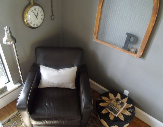
I opted to display it in a a prominent corner of my sitting room.  I attached this curvy hook to the crown molding and let the window dangle from an extension of chain. 


The *chain idea was a signature detail that I borrowed from designer, Carol Hicks Bolton, a number of years ago.  Now, I use them everywhere.


The window's weathered finish pays homage to my love for the tattered style.  It's framing provides the perfect little narrow ledge ~  an ideal resting spot for this vintage letter "P" and this small cross by artist Jan Barboglio.


Simplicity at its best ~ in my eyes.


The beautiful Gothic window adds character to this relaxing little reading corner ~ my husband's favorite space to kick up his feet, sip a cup of coffee, read a spell and ponder all life's happenings.  The leather chair ~ a Pottery Barn purchase; the floor lamp ~ a thrift store find; the oversized wall clock ~ a family heirloom (more about that some other time).  Here's hoping you find time to kick up your feet this weekend. :)

Tuesday, August 9, 2011

Gum Machine Lamp


A number of years ago my mom owned an antique shop filled to the brim with endless amounts of wonderful old treasures.  I've often entertained the thought of owning my own store as well.  Not necessarily a bona fide antique store, but one filled with funky, eclectic, wonderful things ~ things that have the ability to make a house feel like a home. 

During those years, I didn't often have the opportunity to be around the store.  But when I was in town, I would frequent the shop and peruse its aisles, exploring the nooks and crannies of the shop to see what interesting things had taken up residence.  I had my eye on an old vintage gum machine that had been perched on a shelf.  Sadly, a time came when Mimi decided to close the store down but she remembered I had an affection for the gum machine.


And one day to my surprise, she presented it to me (thanks Mimi) and ~   


I filled it with oodles and oodles of gum ~ and turned it into a lamp.  Here's a quick step-by-step how to:
 

1) I had a lamp base made from wood, and had it wired to fit the gum machine.
2)  I fitted it with a lampshade made from a nubby linen fabric.


3) I opted to trim out the shade using all the colors of the gum pieces ~ why not?  A little playful and fun.


I know things are just things.  But I do appreciate the way that some things, like lamps, can make a space feel cozy and warm.  For me this bubble gum lamp does simply that ~ and it's funky and functional all wrapped up in one little package.  Do you have a favorite lamp conversion story?

Friday, August 5, 2011

Myspace


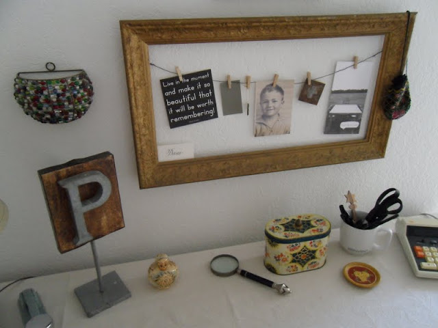
This workspace is where I spend most of my time pondering over posts for Tattered Style.  This little corner of the universe is where I have the liberty to be completely and totally creative.  It's amazing to me how this teeny bit of square footage can provide such a sense of escape and freedom.  There's not one thing, by most standards, particularly indulgent about this spot.  In fact, the foundational piece of furniture, an old university desk ~ was found at a thrift store for less than $20.00.  I tossed a painter's drop cloth over it to conceal the unsightly laminate surface.  The unfinished sketch of the woman and dog was an estate sale find.  It leans casually against the wall and supports the undecorated approach to the room.  


It's the breakdown of all the little "things" on my desk that personalizes this space for me.  Papa's vintage stapler from his desk, a zinc letter "P" from Anthropologie, a set of stacking matryoshka dolls that my son brought me from a trip to Russia, an old English biscuit tin I found at a flea market and a hand painted coaster my son picked up for me in Switzerland.


Above my desk hangs a vintage wooden frame that I found on an antiquing outing.  I've repurposed it into a makeshift "inspiration board."  Meaningful objects are clipped to its wire with miniature clothespins I purchased at Walmart.  It's these little trinkets that inspire and motivate me ~  I could have easily incorporated a bulletin board or magnetic board that would have achieved the same purpose ~ but this appealed to me.


The beautiful hand-calligraphy (Dana) was used as a place card at a friend's wedding reception.   The black card reminds me of two things:  First ~ a memorable time in Chicago with some girlfriends (we each bought one to remind us of our time together) and second ~ it challenges me to live in the moment and make each moment count ~ some advice worth adhering to. The sepia toned photo is a cherished grade school photo of my father-in-law. 

This charming old English print hangs above the "inspiration board"  ~ a prized flea market find I picked up for a few dollars. 


To me, some of the best designed spaces are those that evolve or just happen.  They may not have been laboriously thought out or planned but somehow they end up possessing a wonderful, uncontrived feeling to them.  That's how myspace came to be...I hope you have a corner of the world similar to this ~  providing you the opportunity to dream and be inspired.  Have a good weekend. :)

Tuesday, August 2, 2011

Desk Do-Over


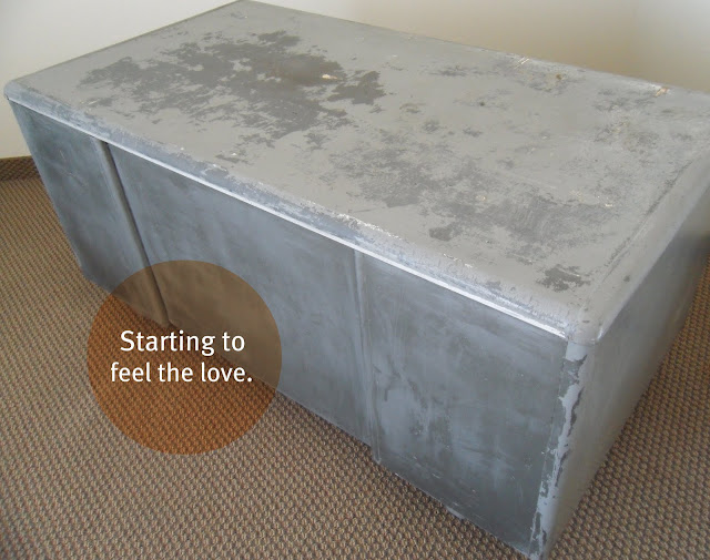
One upon a time there was an ugly desk that had not been well cared for ~ at least for a number of years.  With passing time, neglect had taken its toll on it.  However, upon closer inspection, it was easy to discern that at one point in its lifetime it stood sturdy and strong.  But alas, in it's grimy state, it was in desperate need of rescuing from its dire circumstances.  


One day a kindhearted damsel spotted it on Craigslist and without hesitation, she scooped it up and delivered it to her new office space ~ where amidst all the other castoffs it was given hope.  It was cleaned and sanded and scraped and scrubbed.  It was beginning to feel like its days of despair were over and that there was finally a glimmer of hope for its future.


Okay enough of the tale ~ let's get on with the good stuff.  The desk top was in really bad shape.  So after much thought, I decided to camouflage the ugly by decoupaging it.  I envisioned the desk surface with layers and layers of wonderful old book pages on top.  I found a charming, tattered old book (used also on the Book Page Window Treatment) at a used bookstore and nabbed it.  At the clients request, I also picked up a book with beautiful pictures of Catholic saints to be used as an accent feature atop the other pages.  I tore the pages out of the book and applied them randomly to the top of the desk with good ole Mod Podge ~ found at your local craft store.  


Chapters later ~ literally ~ in my opinion, I ended up with the most unique desk top.   


The additional colorful pictures from the book of saints clearly made the whole project come together.  They gave the desk top a beautiful punch of color (be sure to notice the bright orange desk chair below ~ the two work wonderfully with each other).
 

They also represented a very personalized feature for the client.  To customize a similar project like this, simply add pictures of whatever interests you.


The decoupage treatment on the desk top gave this old retro desk a much needed face lift.


It's now serves as the focal point of the room.

Honestly, the first time I saw the condition of the desk, I wasn't sure how I was going to make it work.  My first inclination was to scrap the desk entirely.  I communicated to my client (Michele) that I would sleep on it and get back with her the next morning.  Thankfully, I did and now a once dingy and forgotten desk has a new lease on life.  

The desk not only provides a generous work surface but also happens to be thought provoking and inspirational at the same time ~ thanks to the choices of book pages applied to the top.  This really was a group effort ~ thanks to Michele, Tolbert, Miles, Rachael and Marty on this project for their help and input.  I have to say ~ I love this desk!

On another note, thanks to an amazing blogger and graphic designer, Emma, for featuring Tattered Style on a recent post ~ see it here.  And lastly, *note* my most recently added "Follow me on Pinterest" button.  Be sure to click on it to see Tattered Style's Pinterest picks. :)  The End!
Related Posts Plugin for WordPress, Blogger...