Friday, July 29, 2011

Faces of Time


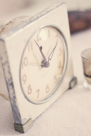
Clocks ~ another thing I have an odd affection for ~ possibly because they tout an array of lovely faces.  I have a love for any type of letters or numerals ~ so why not on a clock face as well?  It really doesn't matter to me whether my clocks work or not.  Honestly, don't most of us look to our cell phones to check the time these days?  I'm not particularly biased when it comes to my collection.  And although these tick-tocks are a motley crew, I do appreciate them for all their uniqueness.  Some may run a little slow while others have broken faces ~ no worries ~ they fit in just fine in my Tattered Style world. Plain and simple ~ I have an appreciation for clocks and thought I might share a few I possess.      


This retro looking electric clock was found at an estate sale.  It purrs softly as it runs ~ eventually it gets behind ~ no bother every now and then I take a moment to adjust it.  


One might think this is vintage, but it's not.  It's a nice little knockoff from Pottery Barn.  I think they did a lovely job ~ and this one actually does keep good time which makes my husband happy.  


I know ~ this one has a broken face but it's so wonderfully tattered.  I scooped this one up at a flea market for a few dollars.  I think it had been passed over many times ~ but not by me. 


Clocks can add a sense of coziness to any setting ~ they're perched all over my home. Here one rests on a shelf in one of my living rooms. Next time you are creating a vignette, why not incorporate some lovely old clocks in the mix as well? 

Also, just though I would let you know, Tattered Style is now pinning on Pinterest ~ click here to view my pins.  I hope you have an enjoyable weekend.  :)

Photos courtesy of Amanda Kate Photography.

Tuesday, July 26, 2011

Book Page Window Treatment


I recently was in a quandary and was trying to figure out a solution for a decorating dilemma. I had pretty much exhausted my budget for a design job, meaning I was really going to have to be resourceful and utilize any leftover materials I had on hand. I was laying in bed late one night and the wheels started turning.  I recalled I had some remnants of an old book I had used from another project and also some random pieces of wood.  I ended up coming up with a unique book page window treatment ~ I gotta tell you that it turned out pretty cool ~ I hope you'll take a closer look. :)   


The supplies for this project included:  Book pages, a scrap piece of wood, jump rings, two "L" brackets and some screw eyes.  I had previously purchased an old book with wonderfully worn and yellowed pages, ($1.98) from Half Price Books. All I did was tear out pages from the book and had them laminated (thanks Michele and Miles).  Next, I punched holes at the top and bottom of each page at the center point and attached jump rings through each hole.  I strung the pages together to equal the desired length.  Then, I cut a board the width of the window and attached screw eyes to the underside.  Following, I affixed the wood piece to the outside of the window frame using "L" brackets.  Finally, I attached the sections of pages with additional jump rings, through the screw eyes.  The number of pages, jump rings and screw eyes will vary depending on the size of window you have.  I think the end result is fantastic. 


I wish you could see how the sunlight filters through the hanging book pages ~ it gives such a warm and wonderful ambiance to the room.  A zebra head and some art (created by Miles, Michele's son) hangs proudly next to the window treatment. 


Take note of how the newsprint, used to decoupage the zebra head, beautifully compliments the typed print on the book pages.  Find the zebra head here.


Here's a shot of the window in the secondary office space that I designed for x2VOL.  The book page window treatment ended up being one of my favorite design elements of the entire project.  


It adds so much punch and character to the room.  This same book page project could be modified to serve as a room divider as well.  I'm so thrilled with how it turned out ~ I'm going to be duplicating it on a window in my own home.  How do you think it rates?      

Friday, July 22, 2011

x2VOL ~ Part II

The cardboard/plywood pendant lights are from Anthropologie.
I think one of my favorite things about design is getting to know the client.  This certainly has been the case in working with Michele ~ I was immediately drawn to this job because of Michele and her excitement and enthusiasm for her company.  Over the last few weeks, I've had the opportunity to learn more about x2VOL, an innovative company that tracks high school student's volunteer hours and also partners them with non-profits that have volunteer needs. Learn more about x2VOL (powered by IntelliVOL) here.     


As I mentioned in x2VOL Part I, the vision for this space was to provide an environment where a number of people could meet, dream together and bring their ideas to fruition.  So, the space required a good sized table.  I just couldn't envision having a typical conference table fill this need, so I opted for a custom farm style table instead.  Thankfully, Michele was on board 100% and with help from a friend of mine who is a wonderful craftsman (thanks Charley) this beautiful table was built. The top is made from new pine planks ~ unlike the legs and skirting which are made from salvaged wood that Charley obtained from a barn that he tore down. The beam used to make the legs is over 100 years old.  We opted to leave the planks natural, but coated them with numerous coats of polyurethane for protection.  


I think the cardboard/plywood pendants and the natural table top and legs mirror and compliment each other quite nicely. 
  

The chairs ~ what can I say except they are spectacular!

One of my favorite "wow" factors in the room are these vintage school desk chairs on casters. Michele scored these off of Craigslist for a song.  They add a punch of color to the space and are quite comfortable.


There was one requirement for this room that Michele was adamant about ~ that there would be an abundance of writing surfaces for brainstorming sessions.  Another noteworthy feature in the room is this wall of marker boards.  Charley did a beautiful job of framing them out with trim that I found at a local salvage yard.  


Another thought I had for the room was to provide an area that would serve as a snack bar. This little nook provided just the right space for a foodie area.  The surface is an old door with some trim on the facing.  The shelving ~ more salvaged wood added space for snacks and supplies.  I whipped up a burlap curtain to conceal the refrigerator and also serve as extra storage.  I think it turned out quite charming.  

That pretty much sums up this space.  However, there's much more to share ~ I'm excited about posting some special projects I came up with for two of x2VOL's offices.  Be back soon with photos galore!  Speaking of photos, I'm on the quest for a new camera ~ my digital point and shoot is on its last leg.  Any suggestions?   

Tuesday, July 19, 2011

x2VOL Office Space ~ Part I


"Finished!" ~ that's what I texted Michele, CEO of  intelliVOL, this past week when I put the final touches on the office her company was moving into.  A priority for this space was to provide ample seating for large brainstorming sessions in order to "Get the job done."  At the same time, it was important to provide a space that would encourage creativity and thinking "outside of the box." The beauty of this project was Michele's willingness to take risks and dare to be somewhat unconventional.  It was such a pleasure to collaborate with her.  Over the next few weeks,  I'll be periodically highlighting various aspects of the project.

The inspiration piece ~ St. Francis of Assisi
 This work of art that Michele had recently purchased was the starting point for the design.  The piece had earthiness and warmth, with a bit of eclecticism.  It told me Michele didn't mind taking risks ~ and that she was going to be fun to work with. 


This is the main meeting room ~ "Before"

 
Here it is "After" ~ with a little detail to follow.


One of my favorite installations ~ Michele wanted to have a wall of paper for brainstorming ~ originally she thought she might like rolls of butcher paper.  I ended up designing these cornice boards out of salvaged lumber and mounted numerous giant 3M sticky pads underneath the boards (this would be a fun element to have in a kid's room or a playroom).  The ledge on the bottom is perfect for holding markers and other misc. office items. 

I found this 12 foot long chunky board at a salvage yard and converted it into a computer bar.  I used plumber's pipe and flanges as the legs for the bar.  It's perfect for plopping a computer on for quick access and is the ideal height to belly-up to.  It also serves as a great work surface.  Additionally, the team often uses PowerPoint during brainstorming sessions.  So, I installed a large projector screen on the wall for viewing.

 
Another fun element in the general meeting area is this wall of galvanized sheet metal.  It will serve as a magnetic board ~ yet another surface to post ideas on ~ the perfect landing spot for photos, memorabilia, notes, etc.


This project was like a breath of fresh air to me.  Michele is a gifted and energetic CEO and was willing to take risks and infuse creativity into her work environment.  Be watching next week as more of the office design unfolds.

Friday, July 15, 2011

Table It!


Who would have ever thought a few weeks ago that this unsuspecting barn door would end up in these wonderful photos taken by Amanda Kate Photography?  It all began a few months ago when Rachael (my designing sidekick) and I were on yet another quest to find that "not-perfect-piece" for a job we were working on.    


We were in search of something we could convert into a table to be used in a large meeting room.  We spotted this forlorn looking barn door at Lots of Furniture and knew at once this would fit the bill.  We loved the generous proportions this door had to offer and were eager to give it a transformation.  It didn't hurt that it only set us back a whopping $20.00.    


It required a few carpentry skills to adapt this door into a table ~ but nothing too daunting to tackle.  Besides ~ if there's ever an opportunity for Rachael and I to operate power tools ~ we're all in!  So, we lugged it back to the shop and went to work.   

 
Corbin jumped in and helped us out on the project.  Here, he and Rachael are horsing around a bit while reinventing this old door.  ** No persons were injured during this process. :)

As the story played out, the table ended up being utilized as a prop for this photo shoot for an ad promoting a teaching series.


More of Amanda's beautiful photography ~ she did this table proud!


It just goes to prove there's potential with just about anything.  After being used as a prop, this table will take up permanent residence in a general meeting space ~ and is guaranteed to be used and enjoyed for years to come. 
 
Please be sure and "Like" Tattered Style on Facebook...thank you. :)

Tuesday, July 12, 2011

Peaceful


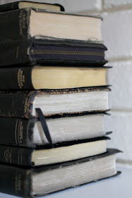
I love so many things about this stack of old Bibles.  I love the way the edges are worn and tattered.  I love the way the gold lettering is just peeking through on some of the spines.  I love the dogeared pages ~ that tell me they've been read, looked through and pondered over.  I love the markings and writings on the pages ~ the margins are filled with thoughts and numerous passages have underlinings.   This little tower of Bibles that I've inherited represent many loved ones and the faith they have had down through the years.  They bring comfort and peace to me.  


And yes ~ I even use these to help bring heart and soul to my home. 


They've rested on mantels and sat on shelves.  Here they sit next to an old Indian printer's block ~ the carved cross in the pattern is what caught my eye ~ notice how it's echoed at the top of the board below.


The Bibles are also accompanied by a wonderful old church attendance board that I found in an Arkansas junk store.  Not too many years ago, boards like these were used to display Sunday School attendance in churches.  Someday I hope to run across some old numbers and letters to slide in the slots. 

These Bibles especially bring peace to me this week ~ not the Bibles themselves but Who they represent and the hope His words bring.  Corbin, our middle son, who has experienced seizures since he was a young boy, will be having surgery on Friday.


He's an extraordinary and courageous young man and never complains.  Our hope is that the procedure will reduce the frequency and severity of the seizures.  If you think about it, would you please say a prayer for him?  Thank you. :)

P.S.  The top two photos were taken by a friend of mine and an amazing photographer ~  Amanda Kate Photography ~ be watching for a future post about Amanda and more of her great work.

Friday, July 8, 2011

Rake Wine Glass Holder


I received an interesting voicemail the other day.  It was from my brother-in-law, Terry, who was in a shop and saw how the proprietor had cleverly used an old rake head as a wine glass holder ~ how smart!  Over the years, I've incorporated old rake heads into many different design scenarios ~ jewelry holders, art, etc. (I'll share more uses in future posts). But honestly ~ I've never thought of them as a wine holder ~ sheer genius! 


I've accumulated a collection of these rusted wonders over time.  They had been discarded and long forgotten by their owners ~ I'm sure since the rake heads had broken off of their handles and they were no longer useful tools.  When I happened across them, I scooped them up ~ with permission of course ~ knowing their future was bright.  They've lived all over my home ~ inside and out.  Such a humble, utilitarian object yet so much potential.


I had to try this idea out for myself ~ here's what the rake looks like without its handle. 


I attached it to the wall using two wood screws ~ making sure to hit studs for added security.  If you are unable to hit studs, I would use anchors so the holder is safely secured to the wall.


To me, it far surpasses any wine holder I've seen in retail markets ~ and I think it gets an A+ for ingenuity and creativity.


The exquisite crystal etched monogram wine stopper was a gift from a dear friend of ours ~ Sydney.  It's quite lovely!


I have a quirky affection for the unexpected, unusual and not so perfect.  Kudos to my brother-in-law for spotting this creative idea.  Maybe you have a clever idea for a rusty old rake head.  I'd love to hear about it.

P.S.  Thanks for the Cab Kym!

Tuesday, July 5, 2011

Lula B's Lamp Find


Recently I was on a buying excursion for an office space I'm designing.  One of the many stops was to Lula B's in Dallas ~ definitely a favorite spot of mine if you are in search of one-of-a-kind incredible vintage pieces.  I spotted this retro cream colored beauty and thought it might be a nice option for a small desk lamp.  But after scouring the store, another lamp became the obvious purchase for my client.  However, I kept going back to this little light and alas ~ I couldn't help myself.  It was yearning to take up space in a dark little corner of my home ~ so here it happily resides. :)


 I love the combination of the clean swirly base with the textured lampshade.  The shade's leather whipstitch is like a cherry on top.

I combined the lamp with this wonderful vintage Swedish cow sign ~ I'll tell my you more about that in another post. I also incorporated some vintage Capiz shell trays into the arrangement ~ Nana bought these in China back in the early 80's.

Capri Blue ~ Volcano
To top off this little grouping, I added in my favorite candle of all time from Anthropologie.  The etched glass container alone is like a fine piece of jewelry to me and the scent ~ well words can't describe.  I remember smiling when a friend of Gavin's came over to visit and I had the candle burning.  He said "This house smells like love" ~ need I say more?  It's wonderful!


I think this charming vignette completes this corner in my home ~ it makes me happy every time I pass by.  I would love to hear about a favorite corner of your home. :)

Friday, July 1, 2011

Wisteria Cart


This post has the potential of sounding like a poorly written *commercial ~ but what can I say? The facts are the facts!  Storage space is scarce in my home so I'm always on the lookout for additional ways to creatively store items.  I fell for a vintage baker's cart at Round Top but practicality was an issue.  


Luckily I ran across this cart at the Wisteria Outlet.  Although it's newly constructed, it has been made from reclaimed lumber so it has the feel of a vintage piece to me. I love it not only because it has ample space to stash everyday essentials like dishes and linens but it also provides a great space for display.   It fits beautifully in this little nook in my dining room.  
  

It's no surprise ~ I love the casters ~ they make it easy to move from room to room.  Which is a good thing for me ~ invariably it will end up in another room in due time.  Another great feature is the way the iron detail frames the piece out ~ it adds character out the wazoo! 


A great place to display my vintage scale collection, crocks, ironstone and more!


This little corner is a little slice of heaven for me ~ the open shelf unit has the feeling of a Parisian style kitchen.  It also holds some of my favorite flea market finds ~ maybe it's a good thing I don't have much storage space in my house. :)  

*See what I mean?